Our branding iron hasn’t been this hot since my ancestors were stealing cows in the old country.
As my great-great grandpa always used to say, “If you want to steal cows, you better have a big logo.”
Wise words from a man who spent his life travelling the world, fleeing one country to the next. He finally made his way to Canada, home of the most recognizable brand in the world, the Maple Leaf, as well his new home, the Kingston Penitentiary.
Great-great grandpa passed along many caveats to his lineage before his hanging, the most relevant being the importance of using colour, negative space and great typography when developing a new logo for your brand.
“Logos are more than just cow marks,” he’d say, “they represent everything you got and everything your ever gonna have.”
Truer words have never been spoken.
It’s safe to say great-great grandpa would love these fantastic new logos we’ve designed recently … if the law hadn’t got to him first.
Opeongo Bowldrome
Opeongo Bowldrome had been using the same old, tired logo since 1949 and wanted something fresh that would appeal to their younger generation of bowlers, but still connect with their mature clientele. We designed a “new retro” logo for them featuring a mix of classic and modern fonts, with a strike of neon blue as an accent. The very next day, The Big Lebowski 2 started filming.

Canadian Collision Industry Forum
While The Dude was throwing strikes, CCIF was preparing for their 20th anniversary celebration and wanted a logo to mark the occasion. The art direction was to design something modern, while incorporating their current, older logo. The challenge was to make it scalable to use for both lapel pins and signage, all the while being bilingual. Challenge accepted. Their new anniversary logo features an overstated maple leaf and understated negative space, fast-tracking their logo into the 21st century.

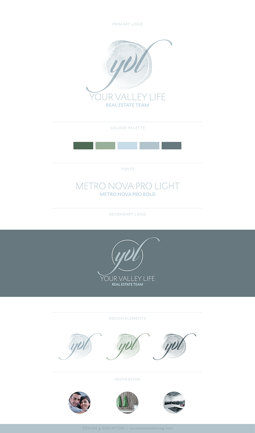
Your Valley Life Real Estate Team
The Aberdeen Angus on the ranch this summer was the new logo designed for Your Valley Life Real Estate Team. YVL wanted an upgrade from the Fiverr logo they were currently using, one that better represented their brand: big city service with a small town feel. The challenge was to blend two very distinct tastes into one and create a logo both partners would cherish. The result: a perfect blend of soft watercolour texture and a mint/steel colour palette to showcase the strength and approachability of the best real estate team in the Ottawa Valley.

Are you ready to rustle up a new logo to represent your brand?
You don’t need to ring the dinner bell to get our attention. Drop us an email and let’s see what we can design for you.

