
If your friend gets a bold new haircut, chances are you’re going to react in one of two ways: “Oh, that looks great!” or “Oh, no. What have they done to you?” Recently, our favourite client relationship management tool, Capsule CRM, hit the branding iron and pressed out a new logo and, well, our reaction was similar to when your friend gets butchered by the barber.
While quality and service are substantially more important to an association’s success than a logo, failing to capture your brand’s identity in a logo can leave members divided and risk damaging your image. A logo is a rallying point for an association, organization or small business, as well as for their members, stakeholders and consumers.
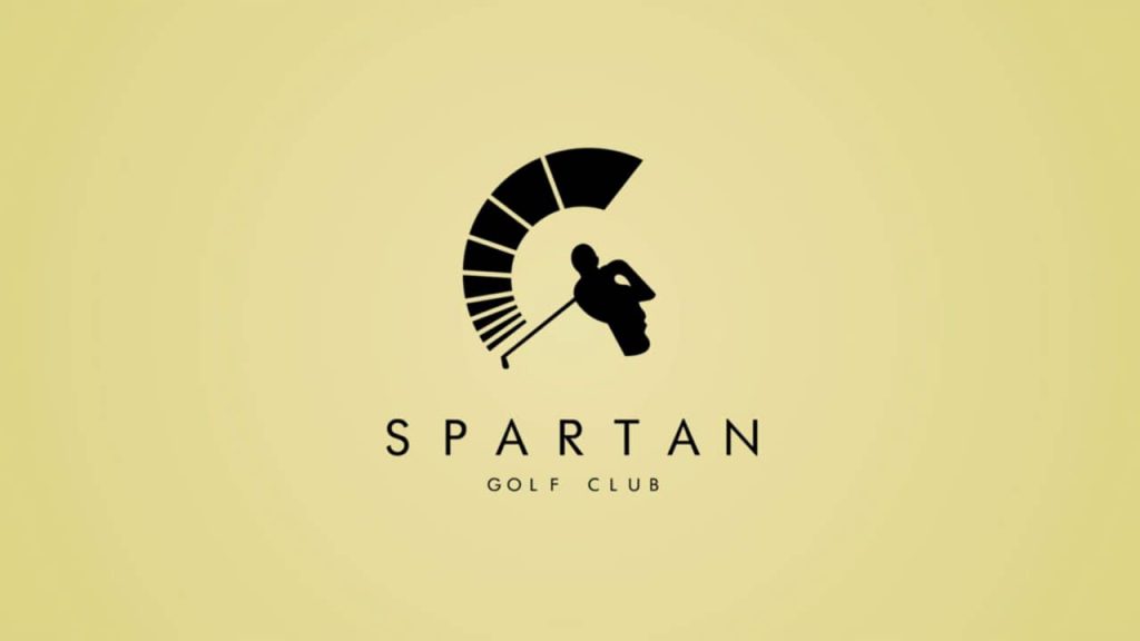
Consider two of our favourite logos: FedEx and Spartan Golf Club.
The FedEx logo is iconic. Their unique selection of colours are in complete contrast to their competition, who chose to go with a dull, earthy brown. Careful colour consideration isn’t the only example of forward thinking they demonstrated with their branding. Hidden in the whitespace between the capital E and lowercase X is an arrow, which illustrates the companies vision of moving forward and transportation. Simple, powerful, and effective.
![]()
We can use the same three words to describe Spartan Golf Club’s logo. Hidden in the whitespace of the golfer’s swing is a Spartan helmet, creating a perfect link between brand name and brand logo.
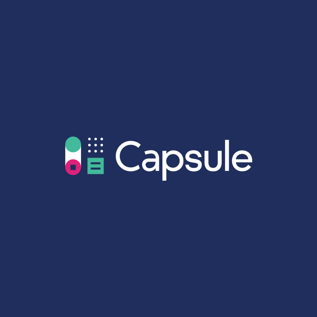
Then, we have Capsule’s latest branding efforts, which leave us confused and disappointed.
Capsule’s new look is far from clean cut and too cluttered for our liking. At first glance, it’s hard to identify what the team was trying to accomplish with the busy graphic, and the typeface leaves us feeling disappointed. While the colours are certainly more modern, the artwork itself is confusing and difficult to rally behind as a consumer. Branding fail!
Here’s what Capsule’s team had to say:
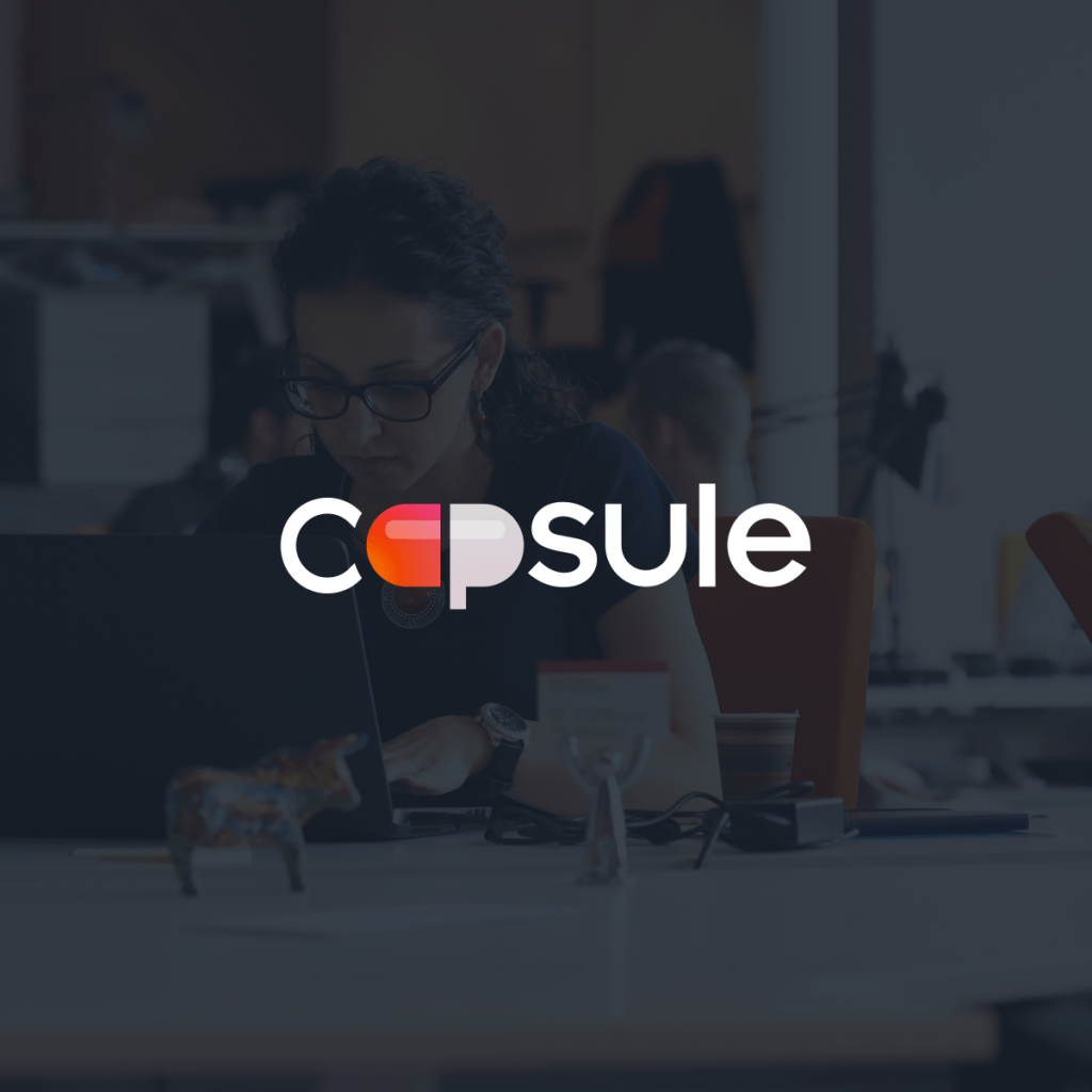
“After many iterations, we clarified that Capsule isn’t a pill you take to cure your business ailments or some kind of metaphorical container. More than that, it’s a powerful control panel to help you take care of your customers and business.”
We respect their decision to distance themselves from the pill metaphor, it’s certainly a more politically correct move, but the pill was a strong rallying image for the brand. Their brand values were perfectly encapsulated in the A and P of their old logo. While a pill doesn’t quite scream CRM, it was still simple, powerful and effective.
Branding should be like a bold new haircut you can be proud of and not a $15 buzz cut from Last Choice. A logo should be the perfect visual representation of what you stand for, in a clean, powerful and effective manner.
What’s your logo saying about your brand?
